
Based on this chart that shows the issue positions of 18 presidential candidates, I don't like any of them. My dream candidate would be Ron Paul and Dennis Kucinich's love child. Link (Via Laughing Squid)
Reader comment:
Jay says:
I ran across this link today, which by choosing a stance and level of importance towards certain issues, your ideal candidate is automatically returned to you via a points-based system. I believe it was built off of the very same chart you posted earlier today. Who says voting requires personal involvement?
Sam says:
I can't say I did a whole lot of fact checking on every single check and "x" on that whole chart, but I did look at health care, which is an important issue to me, and specifically Mitt Romney, who has a unique take on the subject. I don't know what they mean by Universal health care, but Mitt Romney's system is universal health care, but it's not socialized. Mass. already has it – it's like car insurance – it works within the free market system but has regulations so people aren't getting ripped off. The point is, the chart should be corrected because Romney certinaly advocates universal health care, or is should be corrected to say "socialized health care."
Also, I think Clinton has proven she doesn't have the guts to stick it through (having already been paid off by big medicine), but that's a different subject entirely. I guess this chart just shows what a candidate states rather than trying to decode their true intentions.
Kyle says:
I checked the site's overall results page, and found that Dennis Kucinich has been #1 in people's results more times than every other candidate combined. This got me curious, and so I started looking at the code and the data. The algorithm on the site is quite flawed, and it frightens me that anyone would make their voting decision based on these flawed results.
Kucinich and McCain are the only two candidates for whom answers for each question have been given (many are "unknown" or "other"), and the coder has no normalization technique included to ignore these issues (such as calculating the raw "score" for a candidate and then dividing by the number of issues considered).
Second, for example, the algorith treats a candidate who supports the war and a candidate who supports withdrawal (albeit a phased withdrawal) as equivalent! I would have thought that a candidate who supports phased withdrawal would be treated like a candidate who opposes the war (if I as a visitor to the site supported a phased withdrawal, I would have selected "oppose the war" and not "support the war").
Beyond that, the programmer does not allow the user to select "supports phased withdrawal," so it skews the results even more (and as discussed above, the logical answer the user would choose for "supports phased withdrawal" is the exact opposite of what the programmer thinks it means).
mikew says:
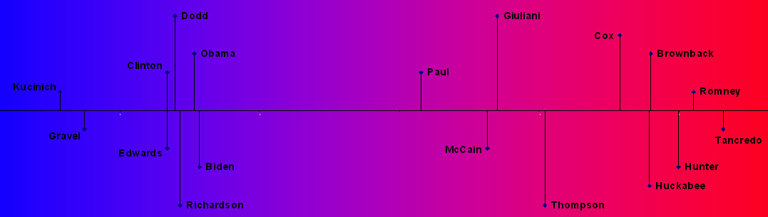
On a whim, I coded the position matrix from your post from a few days ago (support = 1, oppose = -1, Unknown = 0, and grayer responses were -.5 or .5), calculated the distances in 25-space between each candidate, and scaled those distances to one dimension (http://en.wikipedia.org/wiki/Multidimensional_scaling). The result is a purely data-driven look at how the candidates fall that just happens to jive with most of our liberal/conservative intuitions (Note: height of leader lines is just for display purposes). Here's the link


