
Wait But Why has a fantastic series of graphs that aim to help us wrap our heads around the enormous timescales on which forces like history, biology, geography and astronomy operate. By carefully building up graphs that show the relationship between longer and longer timescales, the series provides a moment's worth of emotional understanding of the otherwise incomprehensible.
Humans are good at a lot of things, but putting time in perspective is not one of them. It's not our fault—the spans of time in human history, and even more so in natural history, are so vast compared to the span of our life and recent history that it's almost impossible to get a handle on it. If the Earth formed at midnight and the present moment is the next midnight, 24 hours later, modern humans have been around since 11:59:59pm—1 second. And if human history itself spans 24 hours from one midnight to the next, 14 minutes represents the time since Christ.
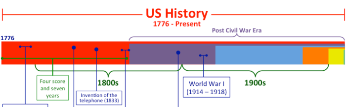
To try to grasp some perspective, I mapped out the history of time as a series of growing timelines—each timeline contains all the previous timelines (colors will help you see which timelines are which). All timeline widths are exactly accurate to the amount of time they're expressing.

(via JWZ)


