

This 1928 London Underground ad is a beautiful and witty example of using data to help people get the best use out of public services. By listing the tube's load at different times of the day, LU helped riders figure out how to avoid crushes, and by making the descriptions funny and insightful, the poster's creators created memorable hooks for putting the info in context.
The ad is part of Transport for London's Transported by Design exhibit, an 18-month series of exhibitions and events "highlighting how transport has shaped London and, through good design."
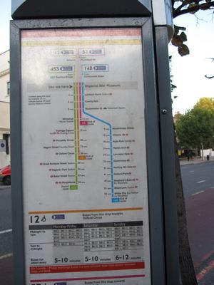
TFL does indeed do really good design work. The schedules on the bus stop poles alone are better than anything I've seen in other cities.
Alas, TFL has a history of bullying people who experiment with the tubemap in fun and informative ways. Just promising not to threaten legal action against people who play with the designs that make up their city would be a great way to celebrate the design of the London transportation network.
Transported by Design
[London Transport Museum]
This 1928 ad for the London Underground combines data with awesome [Citymetric]


